g39 is an artist-led contemporary art gallery based in Cardiff, with an emphasis on installation, photography, video and sculpture.
Golant Media Ventures is an innovation agency for the creative, cultural, digital and public sectors, advising on creating new products, services and experiences, and developing their underpinning business models; generating new revenues, reaching new users and creating organisational capability to deliver successfully; and public and private funding for innovative service development.
The Digital Innovation Fund for the Arts in Wales is a strategic partnership between Arts Council of Wales and Nesta. It is the successor to the Digital R&D Fund for the Arts in Wales that ran from 2013-2015. The fund has supported arts organisations to experiment using digital technology to enhance audience reach or to develop their business model.
innovation.arts.wales
arloesi.celf.cymru
Introduction
Can visual arts organisations effectively use digital tools to gather data from audiences at non-ticketed events, whilst enriching the audience experience?
Our exhibitions are free at the point of access, and this is just one example of how we're committed to reducing the barriers that reduce people's engagement with visual art. But that poses a real problem for us. We want to be knowledgeable and insightful about the people who choose to engage with us, meaning we need to know who they are.
While other organisations can gather data via a transaction – a ticket, a service or goods – we can't connect the names that sit on our database with the people who come through our doors. Sometimes we may not have their names at all. We're in the dark about how much we can attribute our footfall to our efforts in communicating and talking about what we do. We need to find a solution to that problem.
But while the solution must include gathering data it can't simply be about capturing data. We want it to be designed with a meaningful exchange of value at the heart of it. So, we're looking to explore how we can use digital technology to develop a creative transaction between us as a gallery and our visitors.
Through this process of research and development we're exploring what that exchange can look like – whether it's additional content to contextualise a piece of work and provide extra insight, or something that allows exploration of people's emotional responses to specific artworks through a form of interactive digital experience.
For this process of research and development, we have created our own tool for exploring audience responses to art. In its present form, it is an interactive website, with information about the artwork on display, with options to allow the user to access alternative content or to express their opinion about what they're seeing.
The working title for the tool is Audience Response Tool, or 'ART' for short.
Whilst the tool is still a work-in-progress, we are already beginning to think about how the way that our audiences engage with the tool can become an important source of data that can help us to make our programming and curation more relevant to more people.
Our strategic challenge
g39 is an artist-led contemporary art organisation. Our core mission is to increase awareness and understanding of contemporary art in Wales, by providing opportunities for artists in Wales to develop and present their work.
We operate one of the largest exhibition spaces in Wales. We run an exhibition programme and deliver community engagement projects to develop a more diverse audience for contemporary art in Wales. We also offer an artists' resource including a wide range of professional training and development opportunities for practising contemporary artists.
We have a highly loyal core audience, many of whom are highly engaged in the arts as artists or arts professionals. This core audience is constantly evolving and changing, particularly driven by our artist development work, our partnerships with educational institutions, and our broader community engagement activity.
Digital has not been a defining aspect of our work. Yet we have a clear sense that digital technology could provide us with new opportunities to have more in-depth conversations with more people, and that those opportunities could be especially helpful for us in engaging those people who are less likely to engage in our work and contemporary art more broadly.
It became clear to us very early in this process that other visual arts organisations were also thinking about how to address this particular challenge. As a result, we have involved two other arts organisations who can help us to test the tool with different kinds of space and exhibitions, and with different audience groups:
Artes Mundi is an internationally-focused arts organisation that identifies, recognises and supports contemporary visual artists. Artes Mundi is best known for its biennial international Exhibition and Prize which takes place in Cardiff.
Oriel Wrecsam is the premier venue for contemporary visual and applied arts in North East Wales. The organisation, operated by Wrexham County Borough Council, is currently based in off-site locations.
When we originally identified the opportunity for this research it was at a point when we were simply thinking about recording numbers coming through the door. At the point when our technology partner, Golant Media Ventures (GMV) came on board, the challenge was really brought into focus and the idea of a 'value exchange' was introduced. GMV introduced the concept of people's data having value, that they own, and that rather than simply taking that data from people we had the opportunity to give them something in exchange.
At this point we started talking about framing their use of the tool as an exchange – if you share your contact information and preferences with us, we will give you access to exclusive content that we think you'll like. The challenge has really shifted from being less to do with compliance and reporting – which is where we started out from – to being much more of an audience engagement focus.
Research Questions
We developed the following overarching research question:
Can visual arts organisations effectively use digital tools to gather data from audiences at non-ticketed events, whilst enriching the audience experience?
During the first phase of the project we investigated the various curatorial processes of the arts partners, and conducted early user testing. This provided us with a series of concepts and questions for the working prototype of the tool that we would test in real life exhibition settings. Each set of questions anticipated the refinements we would make from one stage to the next.
For our beta tests, we focussed on the following questions:
- Is the tool usable?
- Will people be willing to share data with us on the basis that this is a fair exchange for richer, personalised content about the art?
- Will visitors continue to use the ART tool after visiting the gallery?
- Are gallery staff able to author content that will usefully prompt information on audience taste?
- Will audiences take advantage of social sharing to help the gallery reach new audiences?
- Are users willing to provide their email address before using the tool?
Project Delivery
We carried out the following activities as part of our research and development:
- Project initiation - curatorial workshop
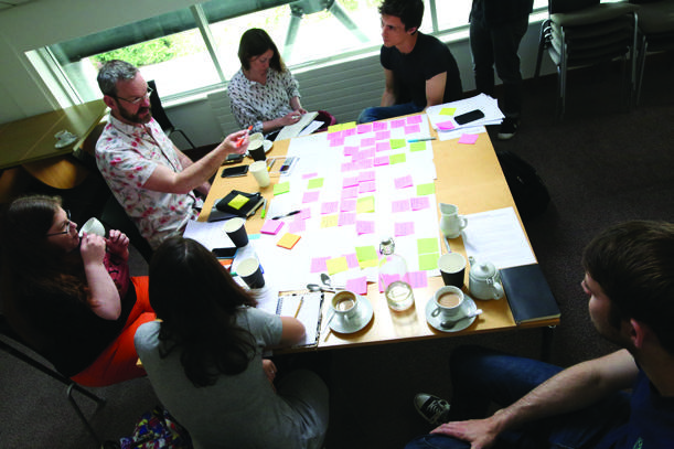
During the first phase of the project we investigated curatorial processes by running a workshop for curators from a range of visual arts organisations.
- Phase I - alpha tests at g39 and Oriel Wrecsam
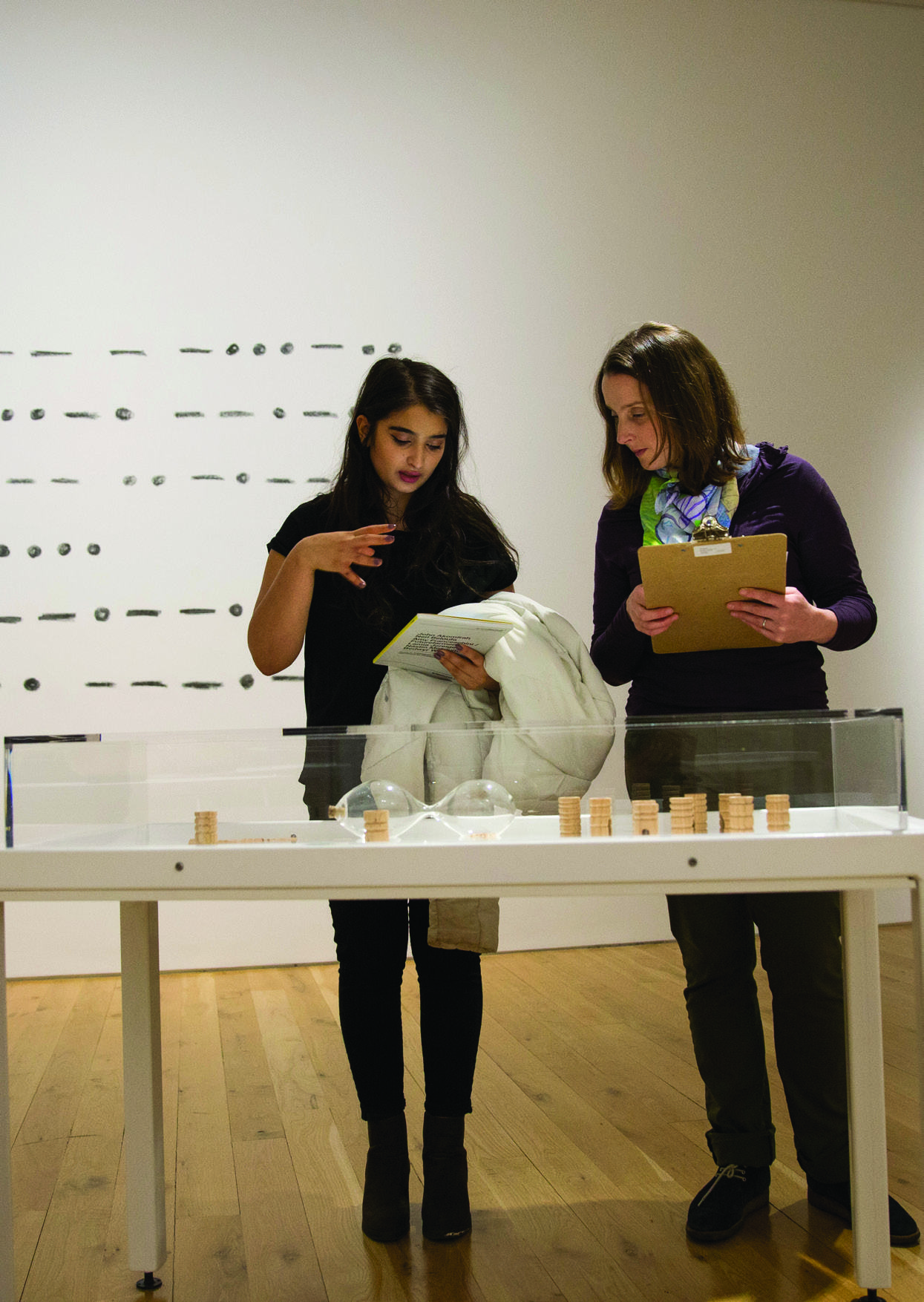
We then conducted two user focus groups at Oriel Wrecsam and one at g39. We used free software (Google Slides) to develop a digital version of the prototype, and presented this along with a paper prototype to members of our audience.
- Phase II - beta tests at g39, Artes Mundi and Oriel Wrecsam
We commissioned a user testing expert to run trial a beta version of the tool in three different exhibition settings.
- A full timetable and budget is included as an annex.
We made the following changes to project delivery:
- Extension of initial testing phase:
We allowed more time for alpha development and prototype testing at the first stage of our research and development so we could try the options out properly in the cheapest most low-tech version available. That impacted the timeline (by delaying the first beta test) but not the overall shape of the project. We also decided to change the order of venues for the beta version tests due to changes in our respective exhibition schedules.
- Focus on functionality and usability:
Our original pitch proposed to experiment with a way of audience profiling that involved creating content using techniques such as Greimas's Semiotic Square. Since this is an unfamiliar theory for the arts we wanted to prove the concept worked at all, and that audiences were also positive about the possibilities before trying different ways of profiling the audiences. And before we could put this principle into practice we has to ensure that the platform design was adequate for the multiple choice functionality required. This meant that we had to focus on the establishing the basic functionality and usability before we reached a point where we could really begin to experiment with new methods for understanding audience response.
Project initiation – curatorial workshop
To inform the alpha tests we held a workshop with curators from g39, Artes Mundi and Oriel Wrecsam to inform our alpha tests.
Exercise 1 - Identifying intended users
At the curatorial workshop we identified user groups for each venue based on those we already have and those we want to target. We created profiles of these segments, describing them in as much detail as possible and assigning a level of priority to them.
Next we identified one key group for each venue and created one or more personas for that group (what do they like, what's their age, do they attend, if not why not? etc) as a way of considering our intended users.
Exercise 2 - Engaging intended users
We then used these personas as the basis for a discussion around the kinds of conversation that a curator or other staff member might have with our intended users in real time.
Exercise 3 - Lifting the lid on the curatorial process
In this exercise we discussed the artist-curator relationship and what could be taken from this to inform the way we generate content for the tool. This exercise also confirmed that the kind of content we were looking to bring forward existed and could be utilised.
Exercise 4 - Design example conversation
We began to lay out a conversation flow for each of the personas we had identified as intended users. A conversation flow is a common tool in designing digital interaction. It is a flow chart that sets out the different routes a conversation can take based on a series of decisions – an example is included below.
We would use this as a template for the interaction we would expect audience members with our gallery tool. We could use these templates to present our ideas for the tool at our alpha workshops.
Example conversation flow
- Greeting > 2
- Have you been here before?
a. Yes I'm a regular
> Of course, just testing! > 3a
b. Yes once or twice
> Ah, hope that means you like what you saw last time > 3a
c. Ages ago
> Great to see you again, hope you've been keeping well > 3b
d. No, it's my first time
> Extra glad to see you made it then > 3b
-
a. [VENUE PROMPT]
i. [J's response 1]
> Ok, let's get stuck in > 4c
ii. [J's response 2]
> Ok, let's get stuck in > 4c
b. Contemporary art's a bit weird isn't it? Want a few pointers?
i. [J's response 1]
> No problemo! etc > 4b
ii. [J's response 2]
> Ok, let's get stuck in > 4c
...etc
Tips for designing a good conversation flow
- Base the conversation on a typical exhibition or artwork that is rich in curatorial content.
- The conversation shouldn't be longer than 5 or 6 exchanges, and each exchange should have a maximum of 4 options.
- It should be concise. There's no room for superfluous fluff. But it's often good practice to write more and then edit back.
- Think about the kind of conversation you have when you're incredibly busy.
- Don't get hung up on making it sound like an authentic conversation with a human. Think about the tool being a member of your front of house staff and give it a voice and an identity that suits your organisation.
Phase I - alpha tests at g39 & Oriel Wrecsam
During phase I we conducted two user focus groups – one at Oriel Wrecsam and one at g39 – with selected members of our respective audiences. These utilised both a paper prototype and a basic digital version of the tool built using the free software Google Slides.
We created audio recording and transcribed excerpts of the conversations, as well as documenting user responses via photographs and their own annotated user responses.
Whilst these alpha tests would not give us a broad measure of people's likelihood of engaging with our idea, they gave us an opportunity to begin to explore the different ways that our audiences might respond. We therefore sought to understand the different influential factors in forming their views – for example, if tone can make a difference, under what circumstances might it make a big difference and might it make little or no difference?
At these sessions we asked a series of questions to gauge users' views. Some examples of our questions were:
- How did using the tool make you feel?
- What would make it more enjoyable?
- Did any particular interactions feel "off"? Can you give me more detail?
- What pieces of information were most exciting or interesting?
- If we emailed you following your interaction what content would be most valuable to you?
- Would you use the tool again if you saw it was available in a different exhibition?
- Would you talk to your friends about the experience of using the tool?
What we learned:
- Language: Participants as these sessions told us that quality, appropriateness and tone of the language used is critical to encourage them to engage. They suggested that it should be in-keeping with the tone of the organisation's other interpretive material. It is particularly important to avoid wording that restricts users to a particular value judgement about the artwork, or that assumes something about their emotional reaction.
- Contact details: They found it off-putting when they were asked for personal contact details up front.
- Comment function: They were keen to have the means to make comment on the artwork they were seeing.
- Sharing function: They valued 'uniqueness of experience' and wanted the opportunity to share this via a commenting or sharing facility.
- Feedback and recommendations: That the opportunity to browse through user feedback and other artists would also be welcomed.
Reflecting on the feedback from the alpha testing we developed the beta testing as follows:
- We developed the written content for the beta versions paying particular attention to achieving the right tone in the content.
- We explored ways to replicate gallery noticeboards where handwritten audience responses to an exhibition can be browsed. We looked at existing examples online and identified a comments thread to be a good equivalent, and achievable within the project scope.
- We introduced a sharing facility to various social media platforms.
We also decided to bring in a specialist in user experience (or 'UX'), a concept within the field of design relating to the way people experience using a particular product, system or service. The user experience specialist would observe people using the tool and give us a set of observational data that would complement the data generated by the tool itself.
Phase II - beta test at g39
The first beta version was designed and written for the autumn season at g39 in Cardiff. We called it g39 ART (Audience Response Tool). The first beta test looked at the tool's effectiveness and user experience.
The full user testing report is included as an annex.
We ran six accompanied venue tours at g39 on a Saturday when the gallery was open to the public as normal. Participants from g39's target audience used the tool in situ to explore the exhibition. At an allocated time they visited the venue, either alone or with others (children, partners etc).
Each testing session lasted up to an hour and had four parts:
- Introduction, background and scenario briefing
- Unprompted phase – registration and venue exploration with ART
- Prompted phase – review of registration and exploration with ART
- Final reflections
During this first round of beta testing we focussed on the following questions:
- Is the tool usable?
- Are users willing to provide their email address before using the tool?
- Would users provide more information in exchange for personalised recommendations?
What we learned:
- Content: Users found the content useful and engaging, especially where it helped them navigate the physical space of the gallery and find works within it.
- Navigation: At times users felt they were 'going round in circles.' In-gallery users want to be able to navigate the information provided based on where they are within the gallery (combination with a wayfinding app is out of scope for the project but worth considering in the future). The tool needs a clear hierarchical navigation and home page.
- Offsite preference: Some users disliked using the tool while at the gallery – they preferred the idea of using it to learn more after their visit.
- Registering: Requiring registration and e-mail verification before granting access to content deterred all but the most determined of users. Initially users weren't put off by the concept of registering, but the process itself presented significant problems.
- Social sharing: Users wanted a more interactive interface where they can offer their views and share their interaction on social media.
- Personalised recommendations: Feedback was mixed on the idea of sharing further information in exchange for personalised recommendations.
- Future development: Users were excited about the tool's potential as it improves and as content is added over time.
From this first round of beta testing we learned that the way we propose the value exchange is crucial as well as the point that the offer is made. We observed that people respond better after some connection is established, but setting up the exchange at the beginning of the experience is less likely to be seen as a fair trade-off by the user.
We also discovered that some people have a preference to engage with interpretive material either before or after their visit to a gallery, rather than during. This seemed to us to be an extra opportunity for audience engagement. We added new research questions and included the functionality into the next beta version of the tool, for use at Artes Mundi, in order to explore this concept further.
Phase II - beta test at Artes Mundi
The second beta version was designed and written for the Artes Mundi 7 exhibition that was presented across two venues in Cardiff – the National Museum of Wales and Chapter arts centre.
The full user testing report is included as an annex.
We ran five accompanied venue tours at the National Museum on a Tuesday when the venue was open to the public as normal. The methodology was similar to the first test, with the addition of an expert review at Chapter. This involved our user experience specialist visiting the venue as if for the first time, without having looked at the ART tool for the exhibition at Chapter beforehand.
During our second round of beta testing we focussed on the following questions:
- Is the tool usable?
- Are gallery staff able to author content that will usefully prompt information on audience taste?
- Will audiences take advantage of social sharing to help the gallery reach new audiences?
- Will visitors continue to use the ART tool after visiting the gallery?
- Will people be willing to share data with us on the basis that this is a fair exchange for richer, personalised content about the art?
What we learned:
- Access: All users were able to access the tool on their mobile phones over a 3g connection. However, some users of the wifi connection weren't able to access the tool and didn't immediately consider switching to 3g to see if that worked. Once they found the site, they got started easily.
- Navigation: This aspect was improved and we received fewer of the 'going round in circles' comments. Users were able to navigate the tool easily as the exhibition followed a linear route, however some lost their place in the tool during the test, particularly those who were unfamiliar with the venue. Some of the content was easy to miss on a mobile.
- Content: For most users this was well received as easy to read and not too detailed, others wanted more detail. However the pacing felt unnatural to some users with some interactions being very short and others involving long sections of text.
- Feedback: Users were positive about being able to offer feedback, and said it prompted them to stop and think about the work. In some cases users were confused when their opinion was asked about some works but not others. Others felt their opinion was asked too early and wanted more time to ponder the work. There were positive comments about a desire for the option of social media sharing.
- Off-site preference: All users replied 'yes' or 'maybe' when asked if they would use the tool outside of the gallery.
- Personalised recommendations: All users asked said that they would be willing to share further information about their experience of the work in exchange for recommendations as to future exhibitions, artists and artworks they might want to explore.
The second round of beta testing showed us that the changes we made between the first and second versions were taking us in the right direction but we also saw that some aspects still needed resolving. Once again we saw that the language of the interactive online content was critical to ensure a good user experience.
We also took note that we would need to improve navigation, specifically to allow users to navigate using their browser's back button.
By the end of this round of user testing we made the conceptual leap from thinking of the tool solely as a web-based gallery guide that provides immediate access to interpretive material, to thinking of how it can measure individual taste and demographic information as part of the gallery experience.
We re-worked the value exchange to include a stage of playful questioning up front, followed by a request for personal information which would then be exchanged for an email containing personalised content.
Next steps
Can visual arts organisations effectively use digital tools to gather data from audiences at non-ticketed events, whilst enriching the audience experience?
We have gathered valuable feedback from our audience about how we can offer them a personalised gallery experience whilst learning more about how they engage with the work we present. We have used digital technology to demonstrate a model of how this could work in a range of visual arts settings.
We intend to continue to research and develop the tool, with further rounds of user testing with different audience groups, and a further curatorial workshop to reflect on what we've learned so far. We're also interested to explore ways in which curators can share audience insights with the rest of the visual arts sector.
In the short term, there is additional technical development required to the tool itself, particularly around improving the navigation and creating a simple interface for arts venues to populate the tool with their content. We are currently looking at how the tool could be integrated so as to be linked to the other information we hold about our audiences, such as mailing lists and other records of the interaction we have had with them.
We have also begun to explore the business models that might be able to support the development of the tool in the future.
We still have more to learn about how best to shape the content we offer, and about how to translate our audience's interaction with the tool into actionable insights for our curation and marketing.
We have also come to the realisation that our tool could conceivably be useful for ticketed as well as non-ticketed venues because the potential is to gather not just contact details and a list of the events our visitors have attended, but to explore their response to the work they see, in real time. The future development of the tool will allow us to begin to explore the infinite variety of ways that we can understand how our audience engage with our work.
Annex
Project team
Chris Brown
Company Director, g39
Chris Brown is an artist, musician and co-founder of the artist-run organisation g39. He is responsible for strategic development of g39 within Wales, the UK and beyond. From 2008-12 he was Magazine Coordinator for a-n The artists information company, a leading UK agency for supporting visual and applied artists. He studied postgrad Composition and Jazz at RWCMD (Cardiff). He brings curatorial expertise, copywriting skills and project management to the project.
Katherine Reid
Project Manager, Golant Media Ventures
Coming with a background of R&D projects in technical spaces with a focus on personal data, metadata and personalisation, Katherine brings expertise in project management and research design. Previously she had worked with GMV, the Guardian and BFI around creating metadata around film and articles and was the VP of Operations at a technical start up focused on personalisation. Katherine read psychology and philosophy at Oxford.
Patrick Towell
Chief Executive, Golant Media Ventures
Patrick is an service/experience designer and board-level advisor who has worked in digital media, entertainment, design and technology as well as the public, learning and cultural sectors. He started work in the TV post-production and arts sectors, and via consultancy, policy and technology has ended up supporting innovation and resilience in a range of creative, cultural and digital enterprises.
Sophia Woodley
Design Manager, Golant Media Ventures
Sophia Woodley is an experienced researcher with skills developed while completing a Ph.D. in Modern History at the University of Oxford. During her time with Golant Media Ventures she has designed and delivered research for clients including the Royal Shakespeare Company, Royal Opera House, Birmingham Museums Trust and the BFI, as well as innovative tech start-ups such as Arithmetica and Future Visual.
James Harper
Exhibitions and Marketing Officer, Oriel Wrecsam
James is also Curator of the PERICLO exhibition programme in a freelance capacity. James is a practising artist, studio holder and former Director of The Royal Standard, Liverpool (an artist led organisation with gallery and studios). He also co-directs the artist development agency, Tzuzjj based in Liverpool. James is a graduate of the MA Curating course at Chelsea College of Arts, London. He writes regularly for publications such as Corridor 8, CCQ Magazine and The Skinny.
Catarina Martins
Marketing and Communications Officer, Artes Mundi
Catarina has a Masters degree in Social Communications from Minho University, Portugal. She specialised in advertising and worked as an advertising copywriter for two of the top integrated communications agencies in Portugal, one of which won the Advertising Agency of the Year award several times in both traditional and digital media. She received an Honourable Mention in the 2007 Montepio Cannes Young Creatives competition for her submission in the Digital Advertising category and a Bronze in the 2010 Portugal Cannes Young Creatives competition film category. Since joining Artes Mundi Catarina has been particularly focused on digital communications and web content.
We also received input to the project from other staff members of the arts partners including:
- Anthony Shapland
Artistic Director, g39
- Steffan Jones-Hughes
Arts Manager, Oriel Wrecsam
- Jo Marsh
Learning and Engagement Officer, Oriel Wrecsam
- Clio Ryan
Development Intern, Artes Mundi
Key partner organisations
- 22Creative -
Tech provider
- Chapter Arts Centre
Venue for Artes Mundi 7 exhibition
- National Museum of Wales
Venue for Artes Mundi 7 exhibition
- Emma Cornes
UX testing
- Steve Taylor
Business Support
Golant Media Ventures
GMV is an innovation agency for the creative, cultural, digital and public sectors, advising on creating new products, services and experiences, and developing their underpinning business models; generating new revenues, reaching new users and creating organisational capability to deliver successfully; and public and private funding for innovative service development. They like working with organisations wanting to do something new, different, difficult or perhaps not yet defined. They specialise in creating a coherent whole from disparate elements: digital, data and content; public funding and private financing; physical tangible assets and intangible ones like Intellectual Property; commercial revenues and social benefits. New business models are the glue holding all of these together to create a practical result.
| Month |
Activity |
Milestone |
| Jun 2016 |
Initiation |
1 |
|
Project definition |
|
|
Business requirements |
|
| Jul-Aug 2016 |
Early paper version of the tool - playful testing |
2 |
| Aug 2016 |
Finalise user requirements and definition |
|
| Sept 2016 |
Conclusions and review of early testing |
|
|
Select tech provider |
|
| Oct 2016 |
Develop and launch beta version 1 (g39) |
|
|
Launch beta version 1 (g39) |
3 |
| Oct - Dec 2016 |
Testing period incl UX testing. |
|
| Nov 2016 |
Review version 1 test. Develop and launch beta version 2 incl changes and requirements |
4 |
|
Recruit Business Adviser |
|
| Dec 2016 |
Launch test version 2 (Artes Mundi) |
|
| Dec 2016 - Jan 2017 |
Testing |
|
| Jan 2017 |
Review version 2 test. Develop and launch beta version 3 incl changes and requirements |
|
| Feb 2017 |
Test version 3 (Oriel Wrecsam) |
5 |
|
End, conclusions and next steps |
|
Budget
| Arts partners (g39, Artes Mundi, Oriel Wrecsam) |
Content development/curation, tagging/categorisation, user research, design of questioning/personal meaning framework,data-based programming, data analysis |
£10,750.00 |
| Technology strategy, research, design, innovation (tech partner) |
|
|
| Technical solution delivery |
Requirements, specification, technical project management, procurement (selection, contracting) |
£30,960.00 |
| Research & design management |
Research design, design management, product management |
|
| Business/impact modelling |
Business and benefit models across three arts partners, technology vendors and wider arts sector for the solution; reporting |
|
| External tech/specialist costs |
|
|
| Technology vendors |
|
£ 30.00 |
| Specialist design |
|
£9,720.00 |
| Specialist contractors |
|
£ 9,192.00 |
| UX testing |
|
£2,000.00 |
| Travel |
|
£ 1,234.44 |
| TOTAL |
|
£63,886.44 |
ART UX Testing Report g39
Summary
- Users found the content useful and engaging, especially where it helped them navigate the physical space of the gallery and find works within it.
- The registration process is a hurdle which will stop all but the most enthusiastic visitor from using the ART.
- The tool needs a clear hierarchical navigation and home page.
- People got excited about the tool's potential as it's improved and content is added over time.
About this research
Background and aim
You've created an audience engagement tool for arts venues to enhance visitor experience called the Audience Response Tool (ART). It's designed to build a dataset and help inform decisions about future artistic programs. We tested your beta version. We tested at g39 in Cardiff, looking at the tool's effectiveness and user experience, using test subjects who were a good match for your visitor segments.
Methodology
We ran six accompanied venue tours at g39 on Saturday 12th November 2016 where participants from your target audience used the ART tool in situ to explore the exhibits. At an allocated time they visited the venue, either alone or with others (children, partners etc).
Each testing session lasted up to an hour and fell into four main parts:
- Introduction, background and scenario briefing
- Unprompted phase – registration and venue exploration with ART
- Prompted phase – review of registration and exploration with ART
- Final reflections
Who we tested with
We tested the ART on friends and supporters of g39 who were recruited by the venue. They fell into two main groups:
- 4x Individuals. Mainly practicing artists who are regular, or have in the past been regular visitors to g39.
- 2x Artistic families who visit with their kids.
None of them had seen the beta version of ART before testing.
Mobile devices used for testing
Five people used Apple iPhones (generation four and later), and one used a Samsung device running Android.
Getting started with ART
Summary
To get ART up and running we gave participants two choices:
Only one participant noticed the web address: the others were all too distracted by the QR code, and I had to point it out to them. While one participant chose to download a QR scanner specifically, they all commented that they don't use QR codes but thought lots of other people do. In reality, everyone found the short web address much faster and easier than using a QR code.
Most of the participants struggled to join either the 'public' or 'office' WiFi networks. They were more successful with their cellular networks.
Before accessing the content, our participants had to register. This caused problems for everyone. Most commented that they'd have given up if they weren't taking part in the test.
'There's a lot in the way before you get to see the work'
Initially they weren't put off by the concept of registering, but the process itself gave them big problems.
- Why do I need to enter a password? I'll just forget it anyway.
- Can't my email address just be my user name?
- Surely they're the same thing, like when you're online shopping.
- If I was only coming in for a quick visit I wouldn't bother. It takes far too long.
- I wish I had a tablet for doing this. It's quite fiddly with all the steps.
- I'd prefer not to register. Do I have to? 'What's in it for me?' is what I'm thinking.
- An invigilator with an iPad would make things easier.
Let's look at the process step-by-step:
1. Splash screen
This involves getting to the correct URL and hitting the big, obvious orange button.
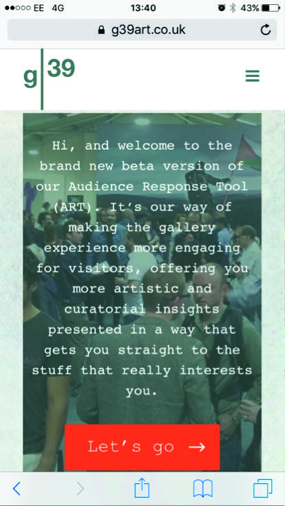
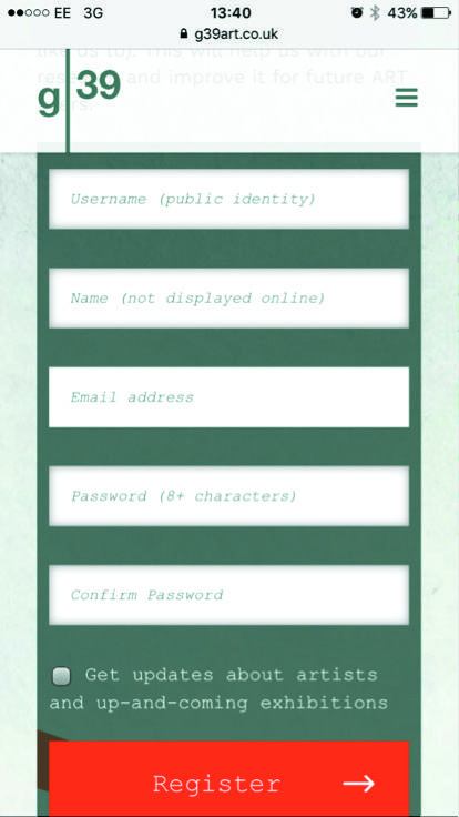
This step demands username, name, email, password and password re-entry, and gives an option for mailing list sign-up.
3. Email authentication
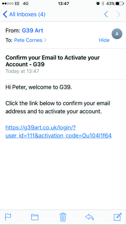
For this step, the user needs to click through a link that they're sent straight away by email.
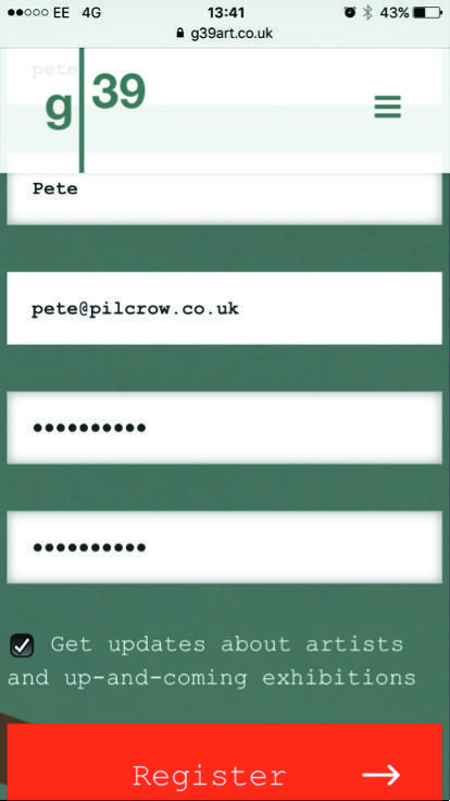
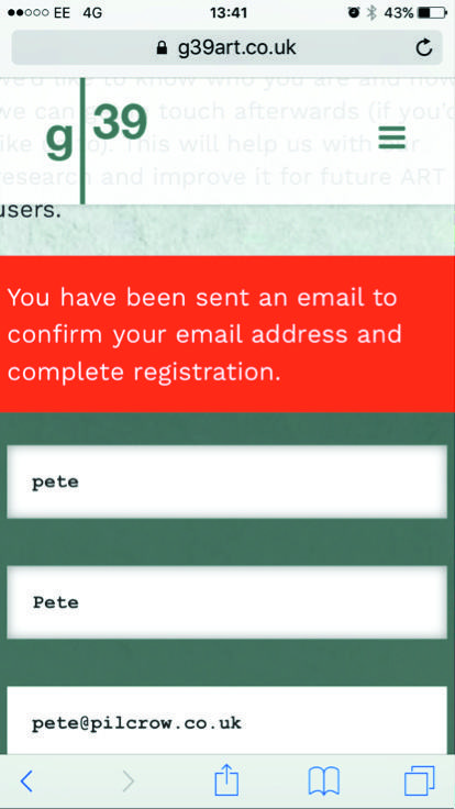
This is when user disengagement really kicked-in. After filling in the form, there were obvious sighs when participants had to check their email. To make matters worse, the dialogue box telling users to check their email wasn't always visible when the page opened. This is because the page opens at the bottom (second screenshot above) and the message is at the top (third screenshot). Some users needed prompting to find it.
Another problem is finding the email. All participants could check their email on their device, but two needed prompting that it was in their 'junk' folder. And because it was classified as junk, their device disabled the link: they couldn't get back to the site without copying and pasting the link.
4. Login
Users now need to re-enter their username (not name or email address) and password.
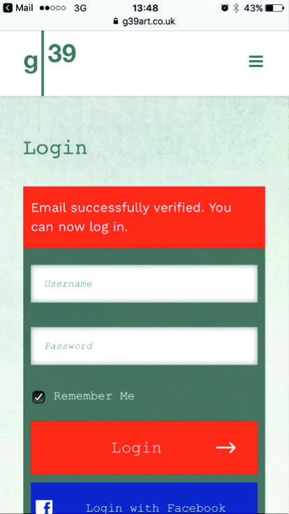
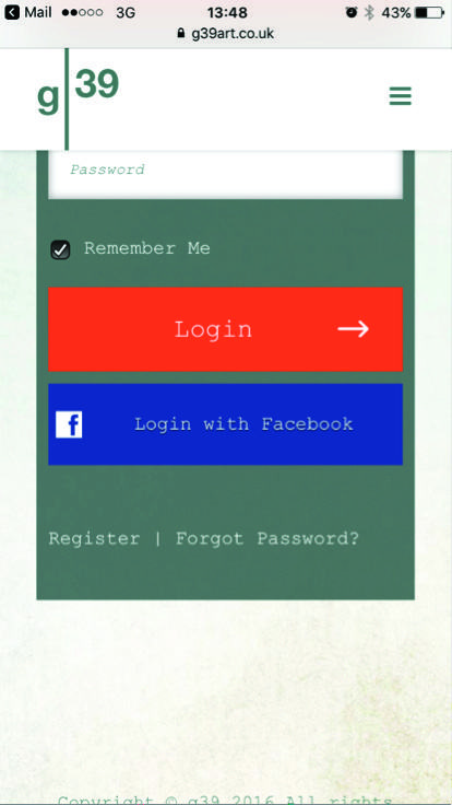
By this point, some users had already forgotten what they'd entered on the initial registration page. People also got confused about the difference between their name, username and email address.
This was the first time that the Facebook integration option appeared: after registration. Some users would have preferred to register through Facebook as it would be an easier process, but I couldn't get it to work myself before testing.
5. Get started
From here, users are ready to start exploring the tool.
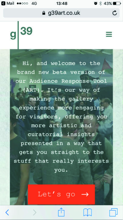
Users were frustrated that after persevering with the registration process, they're back to the page they started from.
'I've gone through all that and it says exactly the same thing!'.
One user also had problems with being logged out:
'It logged me out – that's so annoying. I had to enter my details yet again.'
As a process, registration demands too much information, has too many steps and takes too long. One participant said it feels like
'going around in a circle – you end up where you started, but it takes ages.'
Participants consistently mentioned that they like to speak to people in g39, so help from invigilators could help guide people though the process. Realistically, though, the registration part of the tool needs to be changed to work.
Navigation
During each of the tests the participants took differing journeys around the venue, but patterns emerged. And the biggest stumbling block was the navigation.
Simply put, people couldn't tell where they were in the tool. Each page has links to other pages, but these buttons didn't always make sense and people couldn't tell how they fitted in with the other information. People expected a simple way to see where they are and where they can go next:
It feels like it goes around in circles – it shows me what I've already seen. Buttons I've already looked at re-appear as options again and again.'
It's good, but it's difficult to navigate – there's a lack of flow. You're often left wondering 'have I been here before?'. There are sometimes too many options of things to look at.
The content is good apart from a few formatting issues, but the usability just goes around in circles.
It's friendly, pleasant to have, but the nav is bugging me. You get lost when you least expect it.
Wouldn't it be better with a spatial diagram? Simple orientation is what you need. It's quite linear at the moment and its quite easy to feel lost in it. You need to link it to where you are in the building and take it from there.
It needs an option to get back to the start and a home page that's not the end of registration page
Clear up the buttons so you're not going around in a loop.
There are a few clear issues that contribute to this response:
No index page
When people click 'Let's go' on the front page, they expect the next page to give them an overview. This could be as simple as a page stating 'there are three areas to explore' which gave links to each of them, or it could even be a plan of the gallery doing the same.
Pages don't have unique URLs: they all resolve as https://g39art.co.uk. The biggest problem with this is that it breaks the standard usability convention of the 'back' button or swipe. Users were infuriated when they tried to go 'back' and reached the 'let's go' page again.
'You can't seem to get back to the beginning. When I try to go back [by swiping back a page] it just takes me to that 'let's go' page again. I want to see the page after that. The one we started on. That's so annoying. More going around in circles.'
Pages load below the content
When clicking certain buttons, the new page sometimes loads at the bottom. This means that users could only see more buttons, not the actual content, which felt like they were stuck in a loop. Sometimes, they'd just keep clicking buttons because they couldn't tell they needed to scroll up to see the content.
No 'visited' style
Users wanted to see a different text colour for links to pages they've already visited so they know where they've been already. In web design terms, this normally means a darker or duller colour for the 'visited' style.
One participant raised a very interesting point about the language used on the buttons and your analysis of the data it shows: 'As it stands could end up with misleading info. The language leads you to specific links, rather than actually being interested in something.'
The buttons weren't always activating at first touch.
Content
Once people got to the content, they generally engaged with it well. The most successful content was that based around the physical layout of the gallery and helped people orientate themselves.
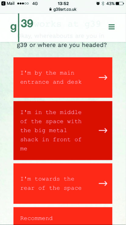
The most useful buttons for exploring the gallery were those that mentioned the physical layout and helped you orientate yourself:
The language:
People loved the language; 'it feels on brand and like Chris was right there with you, it's not as dry as the printed sheets' and 'that's great - I feel like I'm walking around with a Robot Chris'. The length of the content on each page was thought to be about right, but comments were made that you need to be careful with formatting. Reading on a mobile device needs plenty of paragraph breaks to increase readability. Only one participant felt the language was too colloquial.
What works?
This is where I am in the space' buttons. I don't need the other stuff.
The language is really good. It's very friendly.
I like how the content is written and categorised. It's easy to know where to click. And I like the images.
The inclusion of images where you get them. It needs to be more visual, rather than simply text based. The text is clear and easy to read.
The orientation options – where it asks 'where are you in the space?'. It's the least confusing way of using it - the most fixed. You see those options and know where to go first.
Where are you? is the most accessible format. Much better than theme and artist.
"Show me what else I can see” is an enticing title. This thing needs to be more about space exploration. Where are you in the venue and what's there.
From there people could discover more if they wanted to. This could work well as the tool's home page.
Families agreed that this was the most engaging content for their kids as it helped them explore the space. It also meant the adults could enjoy the works while the kids were engaged by something relevant.
People thought that the information on the artist or theme pages was interesting and well written, but probably not what they'd want to read before seeing the work. This is information they'd want to explore afterwards.
What doesn't work?
It's buggy and the login is really annoying. I wouldn't use it on a short visit like this because of this. I don't want the faff. Signal is also an issue. Surely you can just take an email?
Getting into it. It would be better on a larger screen.
There are too many button options and they repeat themselves.
How does ART work in the gallery?
Participants frequently raised the point that they like to explore g39 interrupted, or perhaps with an invigilator if they want to find out more. Apart from using the tool to navigate the works and understand what's there, they said the other information was relevant, but is probably something they'd want to look at after a visit. They also raise the issue that they'd hate to see people staring at screens in a gallery, especially where it could ruin the experience for others (e.g. in works with video and sound).
'Having phones out in films or things like Freya's work could ruin the experience for others. Galleries are one of the last places you can go without people walking around with their phones out.'
'Is a gallery a place you want to use this? I might use it to see what's there, but I'd look at the info at home. It would be too much of a distraction in here.'
'I would rather sit down and watch the film than sit on my phone. And I'd rather have a chat with one of the invigilators, but I guess that sometimes they're busy. I do sometimes take paper info sheets, but I think they just end up in a pile somewhere - I might actually look at the website again, maybe on the bus or train on my way home though, rather than while I'm taking-in an artist's work.'
On the whole, people saw the benefit given the tool's potential. However, with the current 'clunky' login process, they would all have given up before completion.
Some commented that it wasn't clear what you get in exchange for entering your details, and that in the current format you don't get much for your time and effort. It's not much different to picking up the printed information sheets at the gallery entrance.
Does it benefit me in the long term if I sign up? It's not quite clear.
It's a hassle to get in and it's not clear what you're going to get out of it at the moment.
But people agreed the tool has loads of potential, and it's the way forward for galleries sharing information in future. It's part of a change over to digital and it's seen as more sustainable than printed information.
Would you use the ART again?
When asked 'Would you use the ART again?' the unanimous response was yes. But some commented they'd use it outside of the gallery rather than during a visit.
Is the ART something you'd ordinarily use at a venue like this?
Generally, no, but mainly because this is something they're not familiar with, rather than because they'd prefer not to.
A couple of the participants gave an outright 'no' as they don't want distraction or would always prefer to talk to a real person, but said they could see its potential for certain types of visitor including: young people, people who aren't so familiar with the venue when the invigilators are busy, students and kids.
Would you recommend the ART to your friends?
Users answered with a qualified 'yes' in terms of which people they'd recommend it to. These included:
'My housemates who don't have an arts background, but who like to explore. It would help non-artists to engage. People who are up for looking at art, but are a bit baffled by it. Text for me isn't quite there.'
'It depends on their capability when it comes to using a device. Older people might struggle.'
'Yes, my students in particular [lecturer].'
'Groups of young people who IT literate, but the content needs to match their needs.'
'It could be good for the tourists who come in.'
Would it encourage you to visit more often?
Some people said yes, some said no. The families agreed that if the tool could keep their kids occupied while they visit it would certainly improve their visit and encourage more frequent visits. Another participant commented that she might visit more often if she knew she could get the information she wanted about the works without having to speak to someone.
Most of the participants were already on the g39 mailing list and all commented positively about this –
'the more they email me, the more often we go'
was a common sentiment. So getting people's consent for email marketing is likely to encourage people to visit more often.
Did the ART have an overall positive or negative effect on your visit?
Most of the participants agreed that the tool either improved their visit, or had the potential to do so if the login and navigation issues were addressed.
'It was positive, but would be less of a distraction from the art if it was a bit simpler.'
'There's interesting information on it, but it can take a while to get to it'.
'It's good to engage with the kids, otherwise they get bored. This gives them something relevant to keep them amused.'
The main reasons for it being a positive experience related to the information: the content is well written and relevant. There were snippets of information they might have missed out on otherwise.
A couple of the participants said that it would have a negative impact in the venue as they go there to experience the art without distraction, but that the tool could still be useful to them as a follow up. It was something they might read on the way home from a visit as an alternative to the paper sheets which tend to get put in a pile and forgotten about. They come to a gallery as a distraction from digital.
At the end of the test we asked 'Would you be willing to share further information on your interests in exchange for personalised recommendations – on future exhibitions, artists and artworks you might want to explore, etc?'
We had a mixed response to this question. Overall it was a yes – people trust g39 with their information and believe that it'd be used in a positive way to enhance their gallery experience, but people did express some scepticism...
'Yes. It would be great if it asked did you enjoy this [at each work], then email updates could be more tailored.'
'Yes, but only for g39 as I trust them. Not if it were rolled out further.'
'Yes I think so, but I'm not sure. I already trust the curators to pick the right thing. I don't want galleries to become an 'echo chamber' like the news. And I don't want galleries to become another algorithm like Facebook.'
'I hate that kind of thing. It feels like people are watching you and second guessing what you like.'
Naming
Unprompted, half the users suggested that 'ART Tool' or 'the Tool' weren't appropriate names. It might be a tool for you, but for users it's a guide. They also associated the word 'tool' with work, and they don't come to a gallery to do work. People suggested 'Gallery App' or 'Gallery Guide'.
Half the participants suggested functionality that they'd like to add to the tool over time to make it more than simply a guide:
'It could become more personalised, more interactive. Ask questions like "Did you just enjoy that?" about specific things'
Specific things people suggested included
Videos
including those offering more insights from the artisits,
Polls
asking thing like 'did you like this work?'
'Why isn't there social media interaction – like tweet this? You're on your phone already. I'd take a picture of that and share it.' And 'I saw you could comment – nice idea. Could this tie in with social media?'
QR codes on works
'A QR code per work, or giving a map to make the information more relevant to each area in the gallery.'
More photos
'Make it more visual – artists are visual people so add more of it.'
GPS
'so it knows where you are in the gallery, but it might need to be an app to do that.'
Plan view
'Make it more visual based. Make it a plan with dots that you can click on, then expand from there. The ability to back click would also be good so you always know where you are.'
Child-friendly option
'An option of kid and adult version' 'More visuals would be good for kids, especially younger ones who can't read yet'
Bilingual
'It needs a Welsh language version'
ART UX Testing Report Artes Mundi
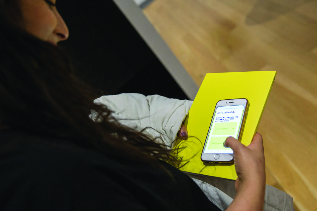
Summary
- Users found the content useful and engaging.
- As they were working their way through the gallery, the tool generally fitted well with users' routes.
- Streamlining the registration process is a huge improvement over the last iteration.
- Users love being asked for their response to works.
- There are still significant issues around the tool's navigation.
- There is a sharp change in pacing when visitors reach the exhibits which can confuse them.
- Overall the response is positive.
About this research
Background and aim
You've created an audience engagement tool for arts venues to enhance visitor experience called the Audience Response Tool (ART). It's designed to build a dataset and help inform decisions about future artistic programs.
We tested the first version of ART at g39 in Cardiff in November. You made some changes afterwards, and then we carried out:
- Accompanied tours at National Museum Cardiff, using subjects who were a good match with your visitor segments
- An expert review at Chapter
Our test subjects
The people we ran the testing sessions with were:
- 4 x students and recent graduates - all visiting on their own, all studied either art or architecture
- 1 x individual who worked in the visual arts
None of them had seen the beta version of ART before testing.
Mobile devices used for testing
Two people used their own Apple iPhones (generation five and later), and one used a Samsung device running Android, another an HTC running Android and one with an iPod Touch 4. The iPod and HTC users had issues running the ART so reverted to using our iPhone 6.
Testing methodology: National Museum Cardiff
We ran five accompanied venue tours at National Museum Cardiff on Tuesday 17th January 2017. Participants from your target audience arrived at a set time and used the ART tool in situ to explore the exhibits.
Each testing session lasted up to an hour and covered:
- Introduction, background and scenario briefing
- Unprompted phase – venue exploration and registration with ART
- Prompted phase – venue exploration and registration with ART
- Final reflections
Testing methodology: Chapter
We also carried out an expert review at Chapter. This involved visiting the venue blind: we hadn't looked at ART for Chapter's exhibition before and we also spoke to gallery staff. We visited and explored as if it were the first time. We include the conclusions we drew from this venue into our results too.
Access
Finding ART
To get ART up and running we gave the instruction to go to: artesmundi7art.co.uk as part of the testing brief with each participant.
This worked fine for everyone using a cellular connection. Those who had connected to the museum's public Wi-Fi couldn't access the page, though. Would this be an issue with the museum's public Wi-Fi network configuration blocking access to the ART? We had to prompt these users to use their mobile data connection instead – they wouldn't have made this connection on their own.
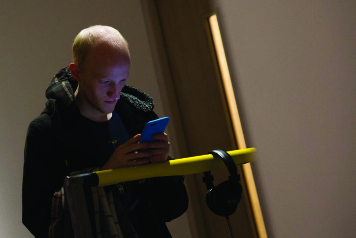
Once they found the site, everyone got started comfortably and easily.
Navigation
Participants tended to get the hang of the ART tool much quicker than they did at g39. The improvements have stopped almost all the comments about 'going round in circles', especially as participants became familiar with the tool and space.
Following the trail
Because of the linear nature of the Artes Mundi exhibition, the participants followed similar linear paths around the venue – and this worked really well with the tool.
That's because the ART now sticks to a much more obvious route. This is partially down to the linear nature of the venue, but the way the ART guides you around is also much more effective and obvious to users than it was at g39. When they were on this route it went very smoothly – particularly if they already knew the venue.
If they left this path, though, they could easily lose their way. Once off route, people found it hard to find their way back in the ART. That's because there's still no main menu, and still no way to go back a page if they realise they've clicked the wrong button. So when people lost themselves or hit the wrong button, they had to restart.
People were using the ART tool in two different ways. It worked best as a linear guide, giving insight as they followed a fixed route through the exhibition. But they also tried to use it as a discovery tool to help them explore while doing what gallery-goers do: backtracking, skipping forward, meandering and stumbling on works that engage them. The navigation works much better for the linear route than it does for the organic discovery approach.
There were some issues that re-appeared from g39. Addressing these issues could definitely help non-linear navigation:
This is still a major usability issue and really frustrates users. It's the only part that still invites 'going around in circles' comments, and it happens frequently. It particularly frustrates users if they get a bit lost and try to go back to the previous screen to find their way, only to find themselves back at the beginning.
On-page navigation
There's no hierarchy to the navigation – it's flat. This became apparent if people got a bit lost, or tried to go back and ended up back on the initial page. People expected to easily navigate back to a particular page if they were mid-way through the exhibition.
Pages load below the content
When clicking certain buttons, the new page sometimes loads at the bottom. This means that users could only see more buttons, not the actual content, which felt like they were stuck in a loop. This was still an issue at both the museum and at Chapter. Sometimes, they'd just keep clicking buttons because they couldn't tell they needed to scroll up to see the content.
What works?
It's really nice. I like that it's yellow like all the signage so it's obvious. I also like that it gives you directions to get to Artes Mundi.
The photos are good - they reassure you that you're in the right place.
It's good. It means you can have a guided tour. You don't have to talk to anyone or feel you're getting in the way by reading the signs on the walls.
What doesn't work?
Which room is the dark one? I can't work out which one you mean.
I kept going around in circles to start with as the yellow buttons were too enticing. I just had to click on them, but that meant I wasn't reading anything. But once I worked it out, it was great and it made me slow down and take things in.
I accidentally ended the tour a few times and ended up on a page that wanted my email address – I must've clicked on the wrong thing, but then I had to start from the beginning again. That's quite annoying when you're already most of the way through the exhibition.
- It asks 'shall we go up?', but I can't see any stairs. Where are they?
I am back at the beginning again – aaarghhhhh!
Content
On the whole, people really liked the content. It was seen as easy to read and informative, but not too detailed.
It's good because you can take it with you and read things in the right place in the gallery. I liked that it tells you to put it away in John's exhibition.
The design and colours look great. It just draws you in and you want to click on things and get started.
Is this the same as the writing on the walls? - [the walls] look more complex.
I'm quite bogged down in all the words – there's too much too soon. You need to ease me into this!
I loved the information given – I actually wanted more info on 'the river' and couldn't find it online, but here it is.
The information is all nice if you don't know too much. I like it when all the text can fit on the screen otherwise it can feel a bit too long.
The buttons make you want to explore. The language is really good.
It's good because it slows you down, but I had some initial problems with pacing. I just wanted to keep selecting options, rather than read text. There was also quite a lot of text.
Pacing
The tool's pacing sometimes confused users at the start of their visit: it starts fast and then suddenly slows down. They started by hitting several clear yellow buttons in a row, which meant they often carried on pressing buttons before they realised they'd gone past the work they were looking at, and then tried to go back a page (which means restarting the tool).
Quickfire introduction pages
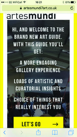
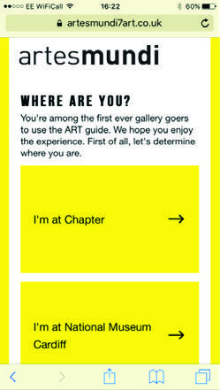
At the National Museum, people used the tool to reach the Artes Mundi exhibition, then entered the first room and spent some time taking in Joreige's work. Only then did they start to use the tool, and would often go past the details about that work without realising. They were simply following the trail of buttons.
This was the page that users would often click past by accident
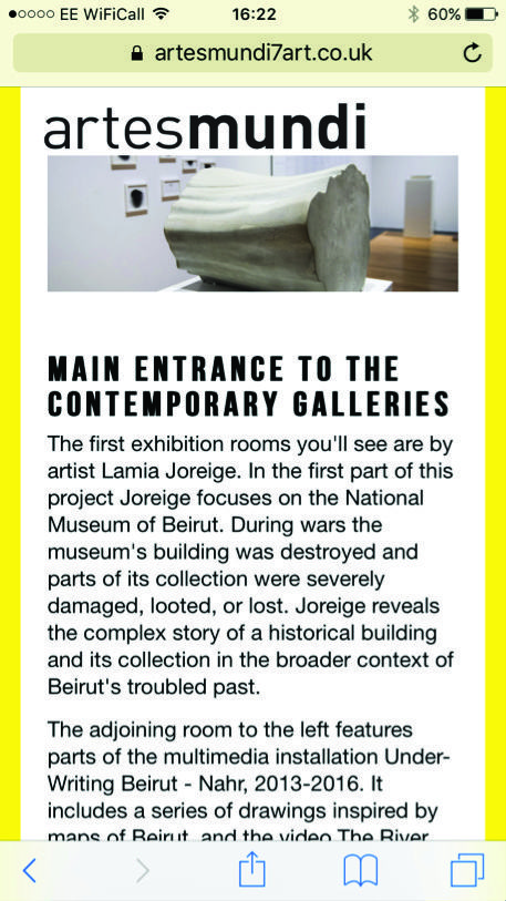
Those who've visited before tended to get into the information more quickly.
If you know the place it's easy to move around, but it takes a while to get into it. You have to do loads of quick clicks then you have to suddenly stop and read a big chunk of text. And once you start getting asked questions about pieces you expect that everywhere. It was quite inconsistent in places.
It took me a while to get into it. You do lots of clicking, then you get hit by lots of text. It's like it goes really fast, then suddenly it changes. That took me by surprise and threw me a bit.
One of the participants who got caught out simply clicking on buttons, and not reading the text initially said she thought the text was too complex. As she got further into the tour and started reading, though, she decided it was actually perfect as it slowed her down and made her take in the works.
Feedback
People loved the opportunity to respond to the questions about how the artwork made them feel. Most of the participants made unprompted comments about how much they liked this feature, but also tended to comment that they expected a tailored response when they answered. They also wondered what they'd have seen if they answered differently.
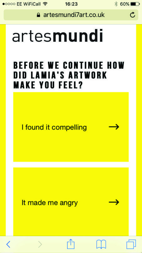
Some participants got confused and answered questions about the wrong works, particularly early in the test. So they were responding to Williams's work while the tool was asking them about their response to the Joreige.
I loved being asked for feelings. It really makes you think and stops you just flying through. It makes you pay more attention.
- I would like to see an option to leave your own thoughts about reactions to a piece.
Maybe it asks you how it made you feel too soon? I need a bit more time to ponder.
Why hasn't it asked me how it made me feel? [leaving Neil Beloufa's room]
What works?
The way the information is presented is great and interacting with it makes it even better. You get the right information in the right place in the room as you're carrying it with you.
The design and colour.
The inviting buttons and the option to give feedback. I'm not sure why I loved the questions so much - maybe because I just love talking about art, but it's also refreshing to see others encouraged to express how they feel.
The information was helpful. It took me a while to slow down and read it, rather than just skim it, but I'm glad I did.
It's a good brief contextualisation – it still leaves you to make your own interpretation. You don't get told too much.
What doesn't work?
You can't go back. It just means you get lost really easily. I had to start again about 100 times!
Not being able to go back ruins it for me. I got a bit lost and it really didn't help.
I want more information. I always want to know more - you could offer even more as extra options
Some of the wording was a bit heavy - it took me a while to get into it.
Some commented on the lack of consistency between exhibits. Once a pattern emerges, people expect the same to happen again – so they were surprised when they weren't asked to respond to Neil Beloufa's or Futurefarmers work. They expected to and wanted to, having already done so for other works.
Would it encourage you to visit more often?
This time we had a consistent 'yes', unlike the more mixed responses at g39. Overall this was because the ART enhanced their experience of the Artes Mundi exhibition and made them feel more comfortable in the gallery environment.
Yes, because it makes me feel comfortable here and I'd read news they'd send me.
Yes, I'd make the effort to visit more often as it improves the experience.
It's less daunting when you can come in and know exactly where to find the information you need. And yes, being on the database would also encourage me to visit. At the moment the Uni tells us to visit, but when I finish I'll need someone else to tell me.
I like to know about what I'm seeing, it enriched my experience so I'd recommend it to others and come along more frequently myself.
I'd visit more often if the follow-up made me aware of new shows.
Would you use the ART again?
Just like g39, when asked 'Would you use the ART again?' the unanimous response was yes, for the same reasons given to 'Would it encourage you to visit more often?'
Is the ART something you'd ordinarily use at a venue like this?
Again like g39 the overall response was, no, but mainly because this is something they're not familiar with, rather than because they'd prefer not to.
Some participants commented that they use paper guides or headphones, but that once they'd worked out how to use the ART it's a better tool as you can use it while looking at the work, the text was more concise and better written than paper guides and that you could take things at your own pace – the headphone tours were seen as pushy/overbearing with information and isolated you from the overall gallery experience.
Would you recommend the ART to your friends?
Users answered with a qualified 'yes', just like they did at g39. This is why:
It'd be great for less arty people like my sister and her boyfriend – ones a doctor and the other a pharmacist. They enjoy contemporary art, but they aren't that experienced or knowledgeable about it.'
It can be difficult to enjoy something like Artes Mundi without a guide, but a tour guide can be daunting for some people. It encourages people to engage.
I'm an art student and learnt things from this, but it'd also be great for my friends who study other subjects, but just enjoy taking in something new.
Positive or negative?
The response was unanimously positive, unlike the mixed responses at g39 (the negativity was mainly towards the login process).
Like g39 the main reasons for it being a positive experience related to the information: the content is well written and relevant.
It's really easy. It didn't make life difficult. It's not obtrusive. It's just there when you need it.
You can read the guide while you walk around. It gives you something to do while you're in there rather than just standing there looking a bit stupid. It's better than an audio guide that you have little control over.
It's easy to use and not stressful. There are nice big buttons and it's not forceful like headphones
It educated me. I don't read the writing on the walls as I like to look at the work and this app means I can go at my own pace and look at both at the same time.
Everyone replied either yes, or maybe.
I really enjoyed it. It saves opening Wikipedia pages when I get back. I would normally take notes then do some research at home. This enriched the experience as I wouldn't have to do this.
I think so. I do that with the printed guides, but it would need to be in a different format without all the steps and buttons.
I was actually looking for more information on Lamia's work the other day. What I was looking for is on this, but I couldn't find it anywhere else. So yes, definitely.
I would for reference to find the name of artists and things I've seen to do further reading. But I'd probably still use Google to do more reading.
At the end of the test we asked 'Would you be willing to share further information on your interests in exchange for personalised recommendations on future exhibitions, artists and artworks you want to explore, etc?'
We received an overall yes to this, with one exception. Pertinent comments include:
It would be a good idea to ask people their reason for visit. That way you could get specific messages to teachers, lecturers, families, artists... You need to know in what capacity people are visiting to give them relevant information. That's information I'd be happy to give and I'm sure others would if it gets them the best information for them.
One of the participants initially said no, He assumed the Artes Mundi show is permanent and doesn't change, much like some of the other exhibits in the museum. When he learned that is regularly changes his attitude totally changed - 'oh, that's not what I expected. Yes, I'd love to know more, especially if you can make it specific for me as an WSA student. I only came here for events like balls before. But I really like this and if it changes I want to see what's new'. Having never visited Artes Mundi before he then spent 1.5 hours after the test in the show using the tool – we kept spotting him during the following two tests.
When we asked this question we received unprompted comments from three of the participants that they liked the feedback/questions elements of the ART and that they'd be happy to do more of it during their visit if it was made easy and relevant. They liked being made to think about the works.
The registration process
At g39 the registration process caused problems for all the testing participants. Moving the registration process from the beginning to the end of journey made a huge improvement to the user experience. They were able to get straight into the exhibition, rather than experiencing a major hurdle to access.
The registration process at the end was less intrusive on the overall experience, and by this point people liked the ART enough that they'd be willing to hear more.
You earned my trust, so I'm happy to sign up.
Yes, but it would have put me off earlier in the process.
I was happy with what the tool did for me so I'm happy to sign up.
The wording at the end [sign up] felt like hidden small print and was much wordier than some of the other text and buttons
We noticed people tried to select multiple options, but couldn't. They didn't always notice this, but those that did said they wanted to select multiple options.
Suggestions included:
More options for feedback – the participants loved being asked how works made them feel.
A bilingual version - Welsh language
A back button!
Audio and video about the works - mainly to use outside the venue
An app, rather than a website so it can use GPS so you don't get lost.
A way to help you back on track if you lose the path without having to start from the beginning again.
The option of more detailed information if you want it.